Many statistical and econometric procedures depend on the assumption of normality. The importance of the normal distribution lies in the fact that sums/averages of random variables tend to be approximately normally distributed regardless of the distribution of draws. The central limit theorem explains this fact. Central Limit Theorem is very important since it provides justification for most of statistical inference. The goal of this paper is to provide a pedagogical introduction to present the CLT, in form of self study computer exercise. This paper presents a student friendly illustration of functionality of central limit theorem. The mathematics of theorem is introduced in the last section of the paper.
CENTRAL LIMIT THEOREM
We start by an example where we observe a phenomenon and than we will discuss the theoretical background of the phenomenon.
Consider 10 players playing with identical dice simultaneously. Each player rolls the dice large number of times. The six numbers on the dice have equal probability of occurrence on any roll and before any player. Let us ask computer to generate data that resembles with the outcomes of these rolls.
We need to have Microsoft Excel ( above 2007 preferable) for this exercise. Point to ‘Data’ tab in the menu bar, it should show ‘Data Analysis’ in the tools bar. If Data Analysis is not there, than you need to install the data analysis tool pack, for this you have to click on the office button, which is the yellow color button at top left corner of Microsoft Excel Window. Choose ‘Add Ins’ from the left pan that appears, than check the box against ‘Analysis Tool Pack’ and click OK.
| Select Office Button Excel Options | Select Add Ins Þ Analysis ToolPack ÞGo from the screen that appears |
Computer will take few moments to install the analysis toolpack. After installation is done, you will see ‘Data Analysis’ on pointing again to Data Tab in the menu bar. The analysis tool pack provides a variety of tool for statistical procedures.
We will generate data that matches with the situation described above using this tool pack.
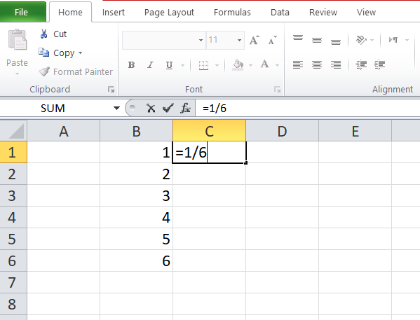
Open an Excel spread sheet, write 1, 2, 3,…6 in cells A1:A6,
Write ‘=1/6’ in cell B1 and copy it down
This shows you possible outcomes of roll of dice and their probabilities.
This will show you following table:
| 1 | 0.167 |
| 2 | 0.167 |
| 3 | 0.167 |
| 4 | 0.167 |
| 5 | 0.167 |
| 6 | 0.167 |
Here first column contain outcomes of roll of dice and second column contain probability of outcomes. Now we want the computer to have some draws from this distribution. That is, we want computer to roll dice and record outcomes.
For this go to Data Þ Data AnalysisÞ Random Number Generation and select discrete distribution. Write number of variables =10 and number of random number =1000, enter value input and probability range A1:B6, put output range D1 and click OK.
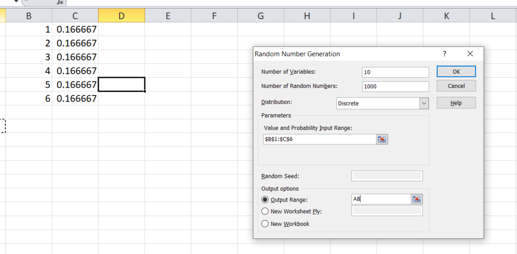
This will generate a 1000×10 matrix of outcomes of roll of dice in cells A8:J1007. Each column represent outcome for a certain player in 1000 draws whereas rows represent outcomes for 10 players in some particular draw. In the next column ‘K’ we want to have sum of each row. Write ‘=SUM(A8:J8) and copy it down. This will generate column of sum for each draw.
Now, we are interested in knowing that what distribution of outcome for each player is:
Let us ask Excel to count the frequency of each outcome for player 1. Choose Tools/Data Analysis/Histogram and fill the dialogue box as follows:
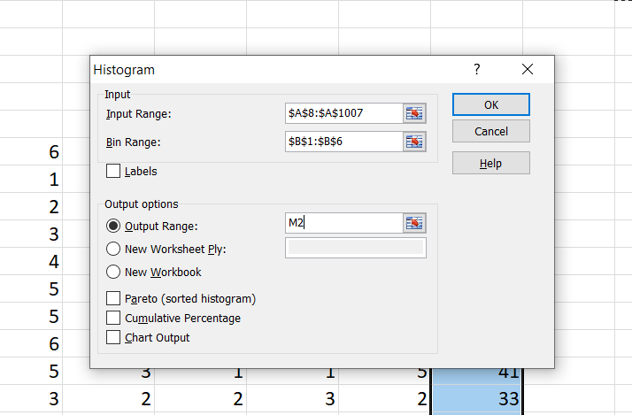
The screenshot shows the dialogue box filled to count the frequency of outcomes listed observed by player A. The input range is the column for which we want to count frequency of outcomes and bin range is the range of possible outcomes. This process will generate frequency of six possible outcomes for the single player. When we did this, we got following output:
| Bin | Frequency |
| 1 | 155 |
| 2 | 154 |
| 3 | 160 |
| 4 | 169 |
| 5 | 179 |
| 6 | 183 |
| More | 0 |
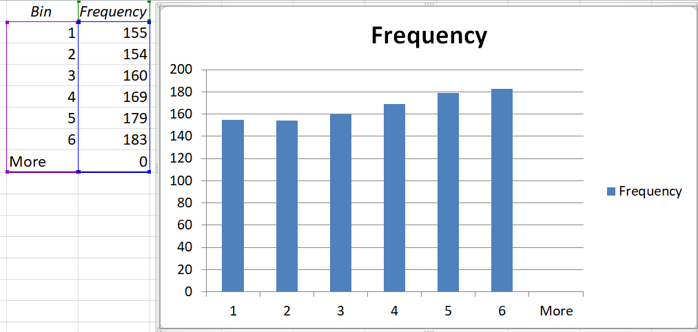
The table above gives the frequency of the outcomes whereas same frequencies are plotted in the bar chart. You observe that frequency of occurrence is not approximately equal. The height of vertical bars is approximately same. This implies that the distribution of draws is almost uniform. And we know this should happen because we made draws from uniform distribution. If we calculate percentage of each outcome it will become 15.5%, 15.4%, 16%, 16.9%, 17.9% and 18.3% respectively. These percentages are close to the probability of these outcomes i.e. 16.67%.
Now we want to check the distribution of column which contain sum of draws for 10 players, i.e. the column K. Now the range of possible values of column of sum varies from 10 to 60 (if all column have 1, the sum would be 10 and if all columns have 6 than sum would be 60, in all other cases it would be between these two numbers). It would be in-appropriate to count frequencies of all numbers in this range. Let us make few bins and count the frequencies of these bins. We choose following bins; (10,20), (20, 30),…(50, 60). Again we would ask Excel to count frequencies of these bins. To do this, write 10, 20,…60 in column M of Excel spread sheet (these numbers are the boundaries of bins we made). Now select Tools/Data Analysis/Histogram and fill the dialogue box that appears.
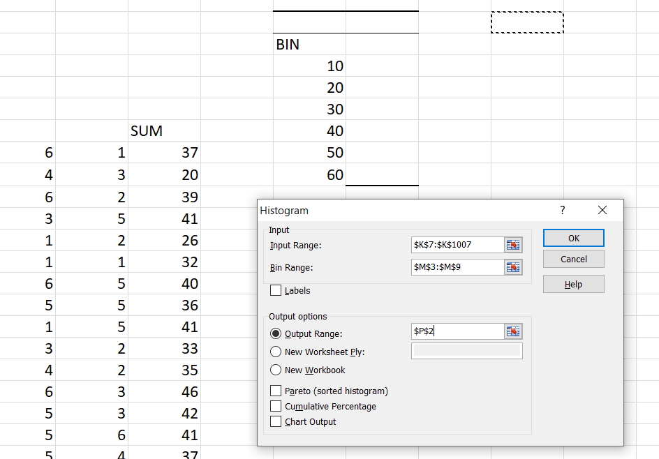
The input range would be the range that contains sum of draws i.e. K8 to K1007 and bin range would be the address of cells where we have written the boundary points of our desired bins. Completing this procedure would produce the frequencies of each bin. Here is the output that we got from this exercise.
| Bin | Frequency |
| 10 | 0 |
| 20 | 5 |
| 30 | 211 |
| 40 | 638 |
| 50 | 144 |
| 60 | 2 |
| More | 0 |
First row of this output tells that there was no number smaller than starting point of first bin i.e. smaller than 10, and 2nd, 3rd …rows tell frequencies of bins (10-20), (20,30),…respectively. Last row informs about frequency of numbers larger than end point of last bin i.e. 60.
Below is the plot of this frequency table.
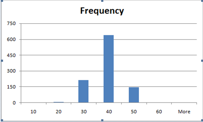
Obviously this plot has no resemblance with uniform distribution. Rather if you remember famous bell shape of the normal distribution, this plot is closer to that shape.
Let us summarize our observation out of this experiment. We have several columns of random numbers that resemble roll of dice i.e. possible outcomes are 1…6 each with probability 1/6 (uniform distribution). If we count frequency of these outcomes in any column, the outcomes reveal the distributional shape and the histogram is almost uniform. Last column was containing sum of 10 draws from uniform distribution and we saw that distribution of this column is no longer uniform, rather it has closer match with shape of normal distribution.
Explanation of the observation:
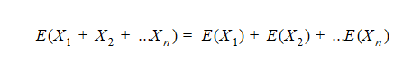
The phenomenon that we observed may be explained by central limit theorem. According to central limit, let be independent draws from any distribution (not necessarily uniform) with finite variance, than distribution of sum of draws
and average of draws
would be approximately normal if sample size ‘n’ is large.
Mean and SE for sum of draws:
From our primary knowledge about random variables we know that:
And

Suppose
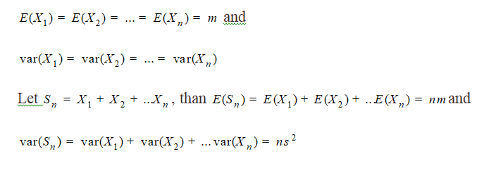
Let , than
and
These two statements tell the parameters of normal distribution that emerges from sum of random numbers and we have observed this phenomenon described above.
Verification
Consider the exercise discussed above; column A:J are draws from dice roll with expectation 3.5 and variance 2.91667. Column K is sum of 10 previous columns. Thus expected value of K is thus 10*3.5=35 and variance 2.91667*10. This also implies that SE of column K is 5.400 (square root of variance.
The SD and variance in the above exercise can be calculated as follows:
Write ‘AVERAGE(K8:K1007)’ in any blank cell in spreadsheet. This will calculate sample mean of numbers in column K. The answer will be close to 35. When I did this, I found 34.95.
Write ‘VAR(K8:K1007)’ in any blank cell in spreadsheet. This will calculate sample variance of numbers in column K. The answer will be close to 29.16, when I did this, I found 30.02
Summary:
In this exercise, we observed that if we take draws from some certain distribution, the frequency of draws will reflect the probability structure of parent distribution. But when we take sum of draws, the distribution of sum reveals the shape of normal distribution. This phenomenon has its root in central limit theorem which is stated in Section …..
Informative article, just what I wanted to find.