Summary: In this article, we will review very useful packages in the R library which allow downloading the data from the World Development Indicators (WDI) of the World Bank. After that, we will execute some simple tools to create a nice graph of correlations and some basic descriptive statistics.
Let’s say we want to use the full power of the information that belongs to the World Bank, but it may be tedious to download the data alone and then import it. We can omit this by using the WDI package in R. so let’s proceed to gather some data!
install.packages('WDI')
library(WDI)
Now that we got the library, we can pick some countries and variables from the World Bank (https://data.worldbank.org/indicator), and then, we proceed to download everything using R. So, I will choose the country of USA, Germany, China, and Brazil for our analysis. And I want to explore the relationship between CO2 emissions and GDP.
To proceed with this task I require to identify the code of the WDI indicators, which can be found in the URL of the variables. like the next image shows.
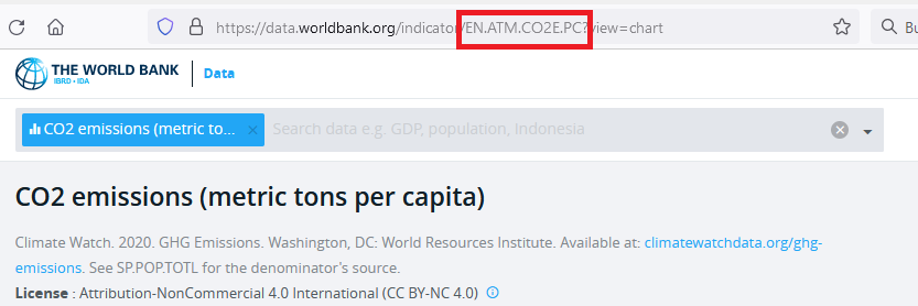
So in this case the CO2 emissions (metric tons per capita) has the code of “EN.ATM.CO2E.PC”, we can repeat the same case for the GDP which is “NY.GDP.PCAP.PP.KD” and with these, we can now put everything in the WDI() function in R like the next code depict.
df <- WDI(country = c("CHN","USA","DEU","BRA"),
          indicator = c("EN.ATM.CO2E.PC",
                        "NY.GDP.PCAP.PP.KD")
          )
Notice that to select the countries we used ISO3 standard format. for China, USA, Germany, and Brazil and also the indicators associated. This will download all the years from 1960’s to the last date, even if there’s missing data.
Now that we put the data in the object df, we can start inspecting what we got now.
head(df)
summary(df)
We can see that there’s a lot of missing data, we can delete missing observations with
df <- na.omit(df)
Let’s say we also want to include a classification to discriminate whether the country is from the OECD or not. Thus we classify based on the ISO3 code manually as:
df$OCDE <- 0
df$OCDE[which(df$iso3c=="USA")] <- 1
df$OCDE[which(df$iso3c=="DEU")] <- 1
The first line creates a variable called OCDE into object df where we have our data. the second line identifies whether the country has “USA” in the variable iso3c contained in df, and if it is true, it will put 1’s in the respective rows for the column OCDE. The same reasoning goes for the third line, where if iso3c code equals “DEU” as Germany, it will insert 1’s in the rows related to the OCDE column in df. As we created the variable with defaults 0’s, all other non-OECD are correctly classified.
You can also improve this to contain characters instead of numbers by using:
df$OCDE <- "Non-OCDE"
df$OCDE[which(df$iso3c=="USA")] <- "OCDE"
df$OCDE[which(df$iso3c=="DEU")] <- "OCDE"
Now that we have cleared the data, and also did an example of how to use WDI packages, we can now introduce some nice descriptive statistics. for such purposes we’re going to load up ggplot2 library and also GGally library.
#install.packages("ggplot2")
library(ggplot2)

#install.packages("GGally")
library(GGally)
Now let’s create some descriptive scatter plot, in which we won’t require year dynamics. and to do so, we’re going to filter the data we have to only the necessary columns. So we create a new object called df_a with the important columns.
names(df)
df_a <- df[,c("EN.ATM.CO2E.PC",
              "NY.GDP.PCAP.PP.KD",
              "OCDE")]
First line tell us the names of the columns, and second line creates df_a with only the columns of the variables we’re interested.
Now we use the function ggpairs from the GGally package and plot it, but we’re going to discriminate also the category of OECD or not. so then we introduce the aes() function inside the ggpairs() such that we got:
ggpairs(df_a, aes(color= factor(OCDE)))
To obtain:
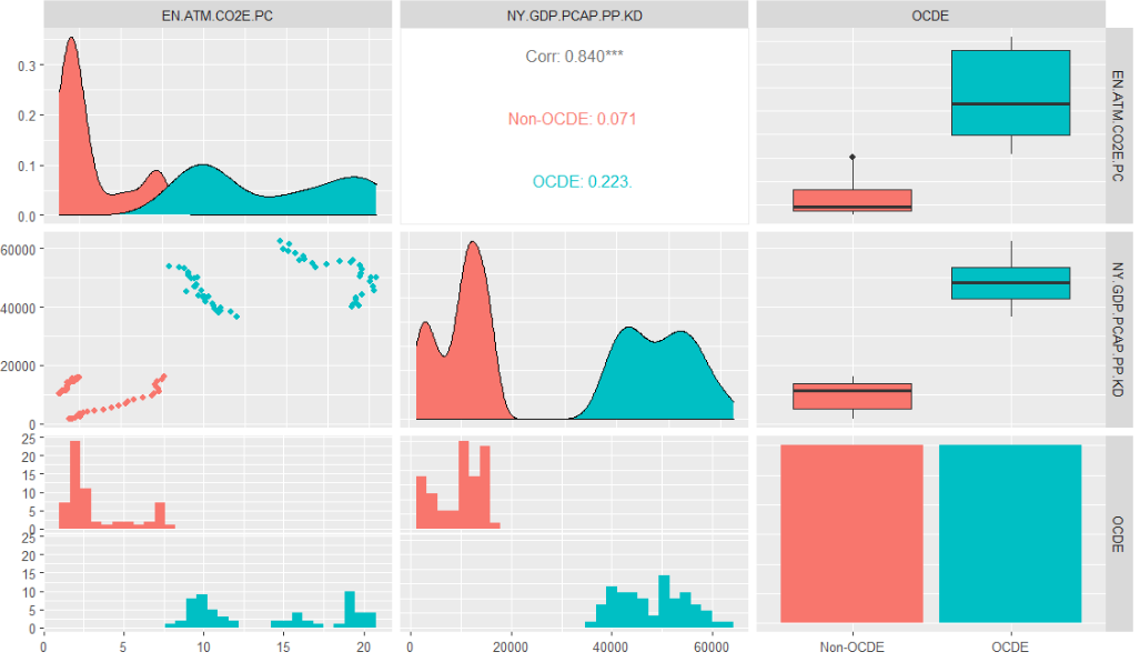
So for the continuous variables like CO2 emissions (metric tons per capita) and the GDP per capita, we can see the respective scatter plots down of the main diagonal. In the actual main diagonal we encounter the distribution of the variables (first by their distributions for each variable and later their proportions), and in the upper diagonal, we encounter the general correlation and the correlation of groups. where No OECD (China and Brazil) and OECD (USA and Germany), are classified by the OCDE variable.
Notice that the third column does not display coefficients of correlations for each group, but rather it proportionates the bar graphs relative to the mean (dark big line in the middle of the boxes), the standard deviation (box), and then atypical values (lines). In the last row, we counter the histogram distribution which is the main input to create the densities of the main diagonal, you can inspect by eye that they’re roughly similar.
With this article, now you are able to use the power of the World Bank data bases, their indicators, and use some elegant descriptive statistics in the form of a correlation matrix for your empirical work.
References
https://cran.r-project.org/web/packages/GGally/index.html
https://cran.r-project.org/web/packages/GGally/GGally.pdf
https://cran.r-project.org/web/packages/WDI/WDI.pdf