When we start to analyze any type of economic relationship, it is often said that we always need to graph the data. The importance of this step is having a visual where we can increase the understanding of our current relationships in the data. Sometimes with this, we can improve the mathematical functional form in the econometric modelling to capture better the relationships and dynamics in the data.
I would suggest to first do the following steps:
- Scatter your independent variable (in the x-axis) against your dependent variable (in the y-axis)
- Observe what kind of linear and non-linear relationships may exists in the graph.
- Place the mean values of the variables to have some sort of idea of what kind of data concentrations we might have.
- Make your inferences accordingly, and do a matrix with correlations with everything.
To do an example of this, let’s make an example with a Data Generating Process of the form:
And to generate the random sample we will use:
clear all
set obs 100
gen n=_n
set seed 1234
gen x=rnormal()
gen x_sq=x*x
gen z=rnormal()
gen y= 1 + (0.5*x)+ (- 0.2*x_sq) + (1.5*z)
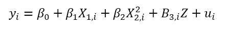
Now let’s see a summary of our variables.
sum
Which will have as a result
Skipping n, which is just the individual identificatory variable, we can see the mean values of these variables. Now let’s start to play with some scatter plots.
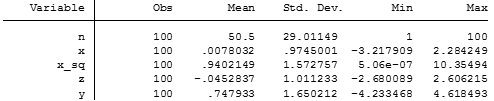
scatter y x
scatter y z
And we will have two graphs that look like this:
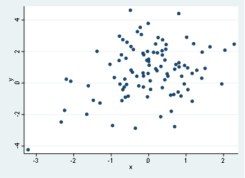
First graph, which is the scatter of y and x doesn’t show any clear relationship, in fact, we might state that there’s no relationship by such dispersion, On the second hand, we find out that there’s a possible linear relationship with y and z.
Let’s go and place the means of each variable in the scatter graph, remember that x mean is 0.0078 and y mean is 0.7479, with these values we will have something like this:
scatter y x, xline(.0078032) yline(.747933)
scatter y z, xline(-.0452837) yline(.747933)
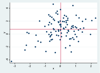
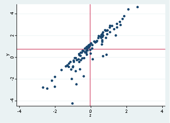
According to this, the data appears to be normal distributed (as it should be since we use a random sampling with normal distribution), in other cases, we might find that the mean is allocated in extreme values in either of the axis, which might imply some sort of kurtosis or non-normal distributions.
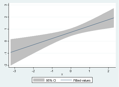
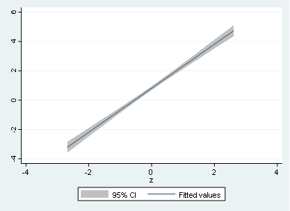
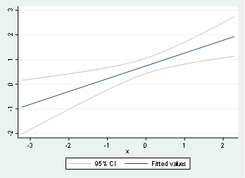
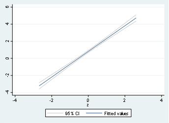
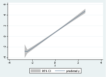
Now let’s use some linear and non-linear predictions using the not so common lfitci and qfitci. To do this, we type:
twoway (lfitci y x)
twoway (lfitci y z)
And the respective output will be:
If we want to use lines instead of shaded area, we might type
twoway (lfitci y x, ciplot(rline) )
twoway (lfitci y z, ciplot(rline) )
And it will display the same graph, but without shaded areas.
We can extend the same idea with non-linear relationships with a quadratic form using qfitci:
twoway (qfitci y x)
twoway (qfitci y z)
And the output of the graph will be:
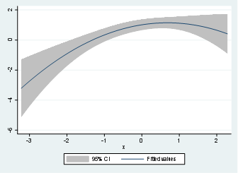

Notice that the quadratic relationship is now more visible using the quadratic adjustment for x and y. Therefore, it is a good practice to perform the quadratic adjustment even when the relationship is totally linear like in the case of y and z.
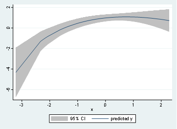
One last type of graphical analysis is using the fractional polynomial, where the syntax is given by:
twoway (fpfitci y x)
twoway (fpfitci y z)
Finally, and to complete the steps we mentioned in this post, let’s do the matrix of correlations. Which is just simply the scatter plots together.
graph matrix y x z
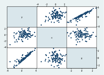
The useful thing to consider with the matrix of correlations is that we can observe not only the scatter plots to a certain variable, but instead we got the scatter plots associated to all the variables we place in the command. Therefore, in regression analysis, this is quite useful to inspect to multicollinearity issues among the independent variables and not only the correlation between the dependent variable.
We can say that similar to x and z, there’s no strong linear correlation since it looks like more like a cloud of dots instead of a linear relationship like it has y and z.
Notice, however, that unless we use a quadratic adjustment, we don’t have it easy to detect the quadratic relationship between y and x, therefore, it is recommended to use the qfitci command to investigate such non-linear relationship.
Bibliography.
StataCorp (2020) Graph twoway fpfitci, Recuperated from: https://www.stata.com/manuals13/g-2graphtwowayfpfitci.pdf#g-2graphtwowayfpfitci
I’m extremely inspired with your writing skills and also with the layout on your blog.
Is that this a paid theme or did you modify it your self?
Either way stay up the nice quality writing, it is uncommon to peer a nice blog like this
one nowadays..
Very nice post. I just stumbled upo your blog aand wanted to say
that I’ve truly enjoyed surfing around your blog posts.
In any case I will be subscribing to your feed and I
hope you write again very soon!
Greast delivery. Great arguments. Keep uup tthe
amazing spirit.
Hello, I enhjoy reading all off your article.
I like to write a little comment to support you.
It’s not my first time to go to see this web page,
i am visiting this web site very often and take good facts from here.
Really interesting information, I am sure this post has touched all internet users, iits really really pleasant piece oof writing on buikding up new website.
This is my first time visit at here and i am really
happy to read all at alone place.
Great looking website. Assume you did a great deal of your very own coding.
You need to take part inn a contest for one oof the
most useful websites online. I will recommend this site!
Veryy good info. Lucky me I discovered your blog by accident.
I have book-marked iit for later!
I am typically to blogging and i actually appreciate your content regularly. This content has really peaks my interest. Let me bookmark your web site and maintain checking achievable data.
Very good written post. It will be supportive to anyone who utilizes it, including yours truly :). Keep up the good work – i will definitely read more posts.
Thank you for any other fantastic article. The place else could anyone get that type
of information in such a perfect means of writing?
I have a presentation next week, and I’m on the look for such information.
I’ve been browsing online more than 3 hours today, yet I never found any interesting article like yours. It is pretty worth enough for me. Personally, if all site owners and bloggers made good content as you did, the internet will be much more useful than ever before.